Adrian Frutiger probably didn’t realize that his work would create a whole style. Remember the shiny, colorful designs of the early 2000s? The smooth and natural look that filled our computer screens and gadgets? That’s Frutiger Aero—a style that defined that time and now brings back happy memories for many. Let’s take a look at where it came from, how it influenced us, and why it still matters today.
What Is Frutiger Aero Nostalgia?
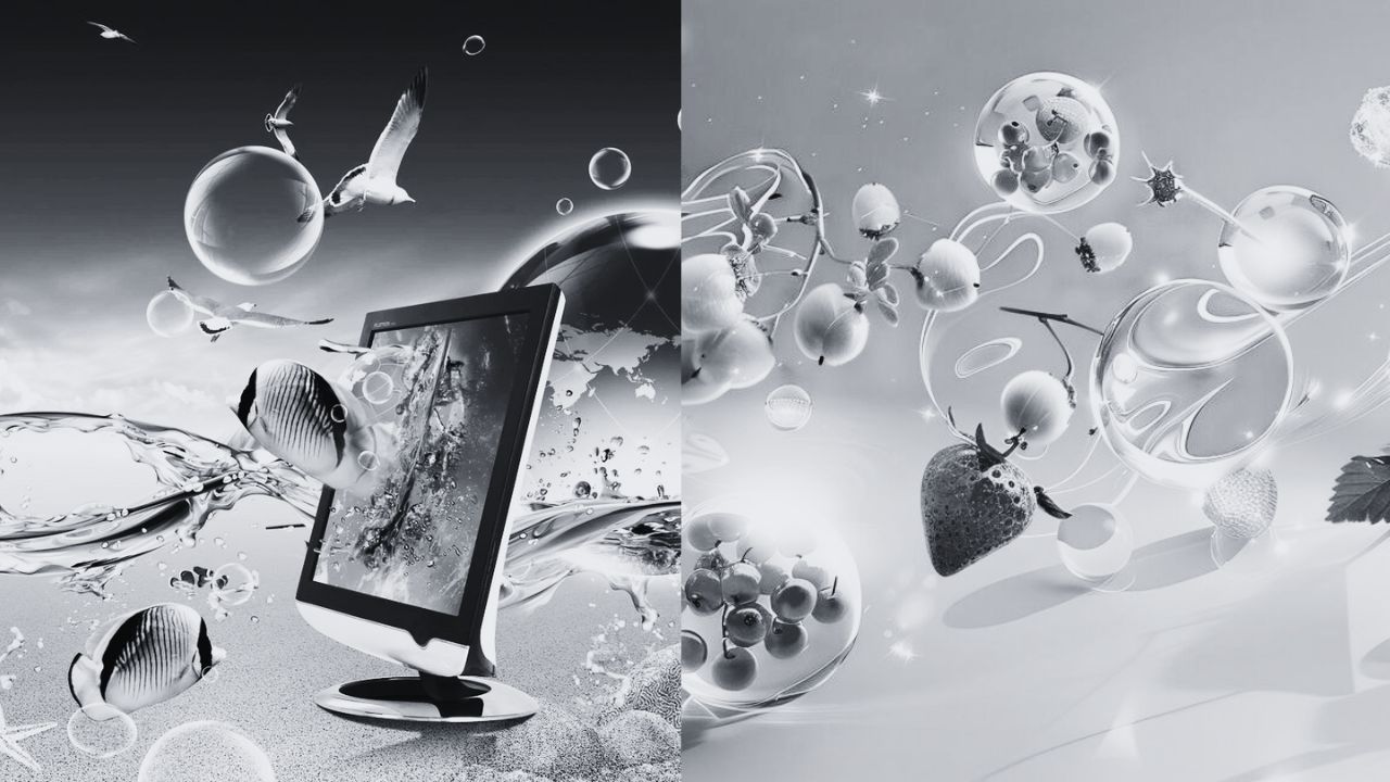
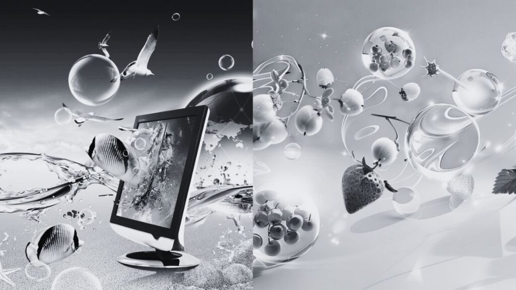
Picture this: shiny buttons, reflective surfaces, vibrant gradients. Throw in some auroras, water droplets, and tons of blue and green. That’s the Frutiger Aero aesthetic in a nutshell. It’s a design style that screams “cutting-edge” and “modern,” at least by 2000s standards.
The name comes from combining “Frutiger,” a popular font by designer Adrian Frutiger, with “Aero,” the glassy, see-through look of Windows Vista and 7. But Frutiger Aero was bigger than just Microsoft. You could spot it everywhere from the Wii to the PlayStation 3, and even in logos, ads, and office decor.
So why the nostalgia? For many millennials and older Gen Z-ers, Frutiger Aero takes them back to their childhood. It conjures memories of their first computer, favorite games, and the general vibe of the 2000s. That sleek, high-tech aesthetic felt like the future back then.
Origins Of Frutiger Aero
Frutiger Aero’s roots lie in the early 2000s design trends. Tech was becoming more prevalent and accessible, and designers wanted interfaces to look friendly and futuristic at the same time. Cue the shiny buttons and nature-inspired textures.

Microsoft was one of the biggest proponents of this style. Windows Vista and 7 really leaned into Frutiger Aero, with their glassy window panes and eye-popping colors. The Xbox 360 dashboard had a similar vibe. But it wasn’t just Microsoft – Apple, Nintendo, Sony, and tons of other brands hopped on the bandwagon too.
Frutiger Aero was part of a larger shift in design. Out with the grey boxy computers and pixelated graphics of the ’90s, in with the sleek shiny future. It marked the transition from the 20th to 21st century in the digital world.
Key Features Of Frutiger Aero Nostalgia
Frutiger Aero was the epitome of cool in the early 21st century. It was all about glossy textures, bright colors, and futuristic vibes.
One of the most recognizable elements was the use of glass-like effects. Everything from buttons to backgrounds had a shiny, translucent look. Gradients and shadows added depth and dimension.
Nature was a big inspiration too. Auroras, water, and other natural textures were popular motifs. They gave designs an organic yet modern feel.
Of course, we can’t forget the Frutiger font! Created by Adrian Frutiger, this typeface was a staple of the aesthetic. Its clean lines and readability made it perfect for digital interfaces.
All these elements came together to create a sleek, efficient look. It felt cutting-edge and sophisticated – like a glimpse into the future.
Frutiger Aero Applications In Technology & Media
If you used a computer or gaming console in the late 2000s, you experienced Frutiger Aero firsthand. It was everywhere!
Microsoft was one of the biggest proponents of the style. Windows Vista and Windows 7 had Frutiger Aero themes baked right in. The Xbox 360 dashboard also got the glassy, colorful treatment.
But Microsoft wasn’t the only one on board. Nintendo used Frutiger Aero elements in the Wii and DS Lite. Sony’s PlayStation 3 had similar vibes. Even Apple’s original iPhone had hints of it!
Beyond operating systems, Frutiger Aero appeared in countless media. Websites, advertisements, posters – you name it. It was the defining look of the era.
For many of us, Frutiger Aero is deeply tied to our memories of technology. It takes us back to a specific time and place. Booting up our first laptop, playing Wii Sports with friends, exploring the early mobile web – Frutiger Aero was the backdrop to it all.
Creating Frutiger Aero-inspired Designs Today
Today, Frutiger Aero is making a comeback – especially among Gen Z. They’re rediscovering and celebrating the aesthetic they grew up with.
If you want to create Frutiger Aero-inspired designs, start with the key elements. Use glossy textures, vibrant colors, and glass-like effects. Incorporate natural motifs like auroras and water.
Don’t be afraid to go bold with gradients and shadows. The style is all about creating depth and visual interest.
When it comes to typography, Frutiger is an obvious choice. But you can also experiment with other clean, modern sans-serifs.
Most importantly, have fun with it! Frutiger Aero is playful and optimistic. Embrace the nostalgia and let your creativity shine.
As you explore the aesthetic, you might come across heated debates. What counts as “true” Frutiger Aero? Is it limited to early Windows and Xbox themes, or is it broader? There’s no clear consensus.
At the end of the day, Frutiger Aero means something different to everyone. For some, it’s a reminder of simpler times. For others, it’s a retro novelty.
Conclusion
Frutiger Aero is a lively design style that captures the early 2000s with its shiny textures and bright colors. This look shaped how we interacted with technology through platforms like Windows Vista and the Wii, bringing back strong memories for many.
As it comes back today, especially with Gen Z, people are excited to celebrate its fun and creative spirit. Ultimately, Frutiger Aero reminds us of a time when technology felt new and exciting, connecting us to our past while encouraging fresh ideas in design.


